image: angganurf
There are moments in product work when the screen stops feeling like a screen.
It starts feeling like possibility.
That was the feeling I had while using Claude Design to shape a frontend UI that felt clean, modern, and unexpectedly alive.
Not just functional.
Not just correct.
Beautiful in the way good interfaces are beautiful, quiet, clear, confident, and somehow lighter than the complexity behind them.
That was the part that stayed with me.
I Was Not Just Generating UI, I Was Chasing a Feeling
When people talk about building interfaces with AI, the conversation often stays at the level of speed.
How fast it is.
How much it can generate.
How quickly it can turn a rough idea into something visible.
That is real, of course.
But it is not the whole story.
What surprised me while working with Claude Design was not only that it could help produce UI.
It was that the process felt surprisingly close to actual design exploration.
I was not just asking for screens.
I was chasing a feeling.
A certain kind of interface.
Something modern without becoming cold.
Elegant without becoming excessive.
Sharp without losing softness.
An interface that felt intentional from the first glance.
And little by little, that feeling started appearing on the screen.
The Best Part Was the Sense of Taste
A lot of generated UI can feel technically acceptable and emotionally empty.
Everything is aligned.
Everything works.
And somehow nothing stays in your mind.
That was what felt different here.
Using Claude Design felt less like forcing a machine to arrange boxes and more like shaping direction with something that could recognize mood, hierarchy, spacing, and restraint.
It understood that modern does not mean loud.
It understood that clean does not mean empty.
It understood that good frontend work is not only about components, but about rhythm.
Padding that lets the eye breathe.
Typography that does not fight the content.
Layout that feels balanced without trying too hard.
Color that adds character without becoming noise.
These are small things when named one by one.
Together, they become the entire feeling of a product.
It Felt Less Like Prompting, More Like Directing
That may be what made the experience so compelling.
At a certain point, I stopped feeling like I was merely typing instructions into a tool.
It started to feel more like direction.
I would refine the visual mood.
Push the structure.
Pull back the excess.
Ask for something more polished, more minimal, more premium, more grounded.
And the interface would move with me.
Not perfectly every time.
But enough to create momentum.
Enough to make the process feel collaborative instead of mechanical.
That matters more than people realize.
Because frontend design is rarely about one perfect command. It is about iteration. It is about seeing, adjusting, sensing what feels off, and moving closer to a layout that finally settles into itself.
Claude Design felt useful in exactly that space.
What I Saw on the Screen Was More Than Output
There is a certain satisfaction that happens when an interface suddenly looks like it belongs in the future you had in mind.
Not a rough mockup.
Not a placeholder.
Not a “good enough for now” screen.
Something genuinely modern.
Something that looks like a product people would trust.
That is what I kept noticing.
Prompt :
Build a dark, premium, single-page landing page for an AI-powered web design agency using React + Vite + Tailwind CSS + shadcn/ui + Framer Motion (motion/react). The page has a luxury editorial aesthetic -- black backgrounds, white text, liquid glass (glassmorphism) effects, and cinematic video backgrounds.
FONTS
Import from Google Fonts:
https://fonts.googleapis.com/css2?family=Instrument+Serif:ital@0;1&family=Barlow:wght@300;400;500;600&display=swap
* Headings: Instrument Serif (italic) -- used via Tailwind class font-heading
* Body: Barlow (weights 300, 400, 500, 600) -- used via Tailwind class font-body
Tailwind config extends fontFamily:
heading: ["'Instrument Serif'", "serif"]
body: ["'Barlow'", "sans-serif"]
COLOR THEME (CSS custom properties, HSL format)
:root {
--background: 213 45% 67%;
--foreground: 0 0% 100%;
--card: 213 45% 62%;
--card-foreground: 0 0% 100%;
--primary: 0 0% 100%;
--primary-foreground: 213 45% 67%;
--secondary: 213 45% 72%;
--secondary-foreground: 0 0% 100%;
--muted: 213 35% 60%;
--muted-foreground: 0 0% 100% / 0.7;
--accent: 213 45% 72%;
--accent-foreground: 0 0% 100%;
--destructive: 0 84.2% 60.2%;
--border: 0 0% 100% / 0.2;
--input: 0 0% 100% / 0.2;
--ring: 0 0% 100% / 0.3;
--radius: 9999px;
--glass-bg: rgba(255, 255, 255, 0.12);
--glass-border: rgba(255, 255, 255, 0.25);
--glass-shadow: 0 4px 30px rgba(0, 0, 0, 0.08);
--glass-blur: 16px;
}
LIQUID GLASS CSS (the core visual effect)
Two utility classes defined in index.css under @layer components:
.liquid-glass (subtle):
.liquid-glass {
background: rgba(255, 255, 255, 0.01);
background-blend-mode: luminosity;
backdrop-filter: blur(4px);
-webkit-backdrop-filter: blur(4px);
border: none;
box-shadow: inset 0 1px 1px rgba(255, 255, 255, 0.1);
position: relative;
overflow: hidden;
}
.liquid-glass::before {
content: '';
position: absolute;
inset: 0;
border-radius: inherit;
padding: 1.4px;
background: linear-gradient(
180deg,
rgba(255, 255, 255, 0.45) 0%,
rgba(255, 255, 255, 0.15) 20%,
rgba(255, 255, 255, 0) 40%,
rgba(255, 255, 255, 0) 60%,
rgba(255, 255, 255, 0.15) 80%,
rgba(255, 255, 255, 0.45) 100%
);
-webkit-mask: linear-gradient(#fff 0 0) content-box, linear-gradient(#fff 0 0);
-webkit-mask-composite: xor;
mask-composite: exclude;
pointer-events: none;
}
.liquid-glass-strong (more prominent, used on CTA buttons):
.liquid-glass-strong {
background: rgba(255, 255, 255, 0.01);
background-blend-mode: luminosity;
backdrop-filter: blur(50px);
-webkit-backdrop-filter: blur(50px);
border: none;
box-shadow: 4px 4px 4px rgba(0, 0, 0, 0.05),
inset 0 1px 1px rgba(255, 255, 255, 0.15);
position: relative;
overflow: hidden;
}
.liquid-glass-strong::before {
content: '';
position: absolute;
inset: 0;
border-radius: inherit;
padding: 1.4px;
background: linear-gradient(
180deg,
rgba(255, 255, 255, 0.5) 0%,
rgba(255, 255, 255, 0.2) 20%,
rgba(255, 255, 255, 0) 40%,
rgba(255, 255, 255, 0) 60%,
rgba(255, 255, 255, 0.2) 80%,
rgba(255, 255, 255, 0.5) 100%
);
-webkit-mask: linear-gradient(#fff 0 0) content-box, linear-gradient(#fff 0 0);
-webkit-mask-composite: xor;
mask-composite: exclude;
pointer-events: none;
}
The ::before pseudo-element creates a gradient border effect using the mask-composite trick (thin glowing border that fades in the middle).
ASSETS & MEDIA URLS
Hero background video (MP4, CloudFront):
https://d8j0ntlcm91z4.cloudfront.net/user_38xzZboKViGWJOttwIXH07lWA1P/hf_20260307_083826_e938b29f-a43a-41ec-a153-3d4730578ab8.mp4
Poster image: /images/hero_bg.jpeg (local file in public/images/)
StartSection video (HLS via Mux):
https://stream.mux.com/9JXDljEVWYwWu01PUkAemafDugK89o01BR6zqJ3aS9u00A.m3u8
Stats section video (HLS via Mux, displayed desaturated):
https://stream.mux.com/NcU3HlHeF7CUL86azTTzpy3Tlb00d6iF3BmCdFslMJYM.m3u8
CTA/Footer section video (HLS via Mux):
https://stream.mux.com/8wrHPCX2dC3msyYU9ObwqNdm00u3ViXvOSHUMRYSEe5Q.m3u8
Feature GIFs (imported from src/assets/):
* feature-1.gif -- used in FeaturesChess row 1 (right side)
* feature-2.gif -- used in FeaturesChess row 2 (left side)
Logo icon: src/assets/logo-icon.png (12x12 Tailwind = h-12 w-12)
SECTION-BY-SECTION BREAKDOWN
1. NAVBAR (fixed, floating)
* Fixed position: fixed top-4 left-0 right-0 z-50, horizontal padding px-8 lg:px-16, vertical py-3
* Left: Logo image (h-12 w-12)
* Center (desktop only, hidden md:flex): Navigation links inside a liquid-glass rounded-full px-1.5 py-1 pill container
* Links: "Home", "Services", "Work", "Process", "Pricing"
* Each link: px-3 py-2 text-sm font-medium text-foreground/90 font-body
* Last item: white solid button "Get Started" with ArrowUpRight icon, bg-white text-black rounded-full px-3.5 py-1.5 text-sm
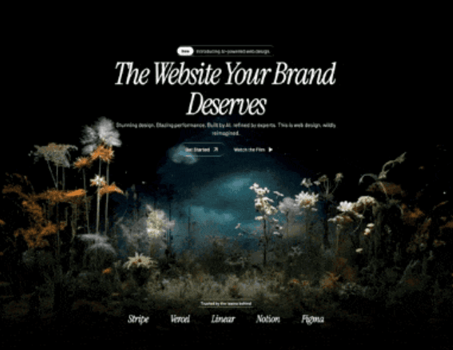
2. HERO SECTION
* Container: relative overflow-visible, fixed height 1000px
* Background video: <video> tag with autoPlay, loop, muted, playsInline. Positioned absolute left-0 w-full h-auto object-contain z-0 with top: 20%. Source is the CloudFront MP4 URL. Poster is /images/hero_bg.jpeg.
* Dark overlay: absolute inset-0 bg-black/5 z-0
* Bottom gradient fade: absolute bottom-0, height 300px, linear-gradient(to bottom, transparent, black)
* Content (z-10, centered, paddingTop: 150px):
* Badge pill: liquid-glass rounded-full px-1 py-1 with inner white "New" badge (bg-white text-black rounded-full px-3 py-1 text-xs font-semibold) and text "Introducing AI-powered web design."
* Heading (BlurText component): "The Website Your Brand Deserves" -- text-6xl md:text-7xl lg:text-[5.5rem] font-heading italic text-foreground leading-[0.8] max-w-2xl tracking-[-4px], animated word-by-word from bottom with blur, delay 100ms
* Subtext (motion.p): "Stunning design. Blazing performance. Built by AI, refined by experts. This is web design, wildly reimagined." -- blur-in animation, delay 0.8s, text-sm md:text-base text-white font-body font-light leading-tight
* CTA buttons (motion.div, delay 1.1s):
* "Get Started" -- liquid-glass-strong rounded-full px-5 py-2.5 with ArrowUpRight icon
* "Watch the Film" -- text-only with Play icon (filled)
* Partners bar at bottom (mt-auto pb-8 pt-16): "Trusted by the teams behind" liquid-glass pill, then 5 partner names rendered in text-2xl md:text-3xl font-heading italic text-white with gap-12 md:gap-16: Stripe, Vercel, Linear, Notion, Figma
3. BlurText COMPONENT (custom animated text)
* Splits text by words or letters
* Uses IntersectionObserver to trigger on scroll
* Each word/letter is a <motion.span> that animates from {filter: 'blur(10px)', opacity: 0, y: 50} (when direction=bottom) through {filter: 'blur(5px)', opacity: 0.5, y: -5} to {filter: 'blur(0px)', opacity: 1, y: 0}
* Staggered by index with configurable delay (default 200ms per element)
* Step duration 0.35s per keyframe step
4. START SECTION ("How It Works")
* Full-width section with HLS video background using hls.js library
* Video: autoPlay, loop, muted, playsInline, absolute inset-0 w-full h-full object-cover
* Top and bottom gradient fades (200px each, black to transparent)
* Content centered (z-10, minHeight 500px):
* Badge: "How It Works" in liquid-glass rounded-full px-3.5 py-1
* Heading: "You dream it. We ship it." -- text-4xl md:text-5xl lg:text-6xl font-heading italic tracking-tight leading-[0.9]
* Subtext: "Share your vision. Our AI handles the rest--wireframes, design, code, launch. All in days, not quarters." -- text-white/60 font-body font-light text-sm md:text-base
* CTA: "Get Started" liquid-glass-strong rounded-full px-6 py-3
5. FEATURES CHESS (alternating rows)
* Section header: "Capabilities" badge + "Pro features. Zero complexity." heading
* Row 1 (flex, content left / image right):
* Title: "Designed to convert. Built to perform."
* Body: "Every pixel is intentional. Our AI studies what works across thousands of top sites--then builds yours to outperform them all."
* Button: "Learn more" liquid-glass-strong
* Gif: https://motionsites.ai/assets/hero-finlytic-preview-CV9g0FHP.gif download and place inside liquid-glass rounded-2xl overflow-hidden
* Row 2 (flex-row-reverse, content right / image left):
* Title: "It gets smarter. Automatically."
* Body: "Your site evolves on its own. AI monitors every click, scroll, and conversion--then optimizes in real time. No manual updates. Ever."
* Button: "See how it works" liquid-glass-strong
* gif: https://motionsites.ai/assets/hero-wealth-preview-B70idl_u.gif download and place inside liquid-glass rounded-2xl overflow-hidden
6. FEATURES GRID ("Why Us")
* Section header: "Why Us" badge + "The difference is everything." heading
* 4-column grid (grid-cols-1 md:grid-cols-2 lg:grid-cols-4 gap-6), each card is liquid-glass rounded-2xl p-6:
1. Icon: Zap -- "Days, Not Months" -- "Concept to launch at a pace that redefines fast. Because waiting isn't a strategy."
2. Icon: Palette -- "Obsessively Crafted" -- "Every detail considered. Every element refined. Design so precise, it feels inevitable."
3. Icon: BarChart3 -- "Built to Convert" -- "Layouts informed by data. Decisions backed by performance. Results you can measure."
4. Icon: Shield -- "Secure by Default" -- "Enterprise-grade protection comes standard. SSL, DDoS mitigation, compliance. All included."
* Each icon sits in a liquid-glass-strong rounded-full w-10 h-10 circle
7. STATS SECTION
* HLS video background (Mux URL), displayed with filter: saturate(0) (desaturated/B&W)
* Top and bottom gradient fades (200px each)
* Content: liquid-glass rounded-3xl p-12 md:p-16 card with 4-column grid:
* "200+" / "Sites launched"
* "98%" / "Client satisfaction"
* "3.2x" / "More conversions"
* "5 days" / "Average delivery"
* Values: text-4xl md:text-5xl lg:text-6xl font-heading italic
* Labels: text-white/60 font-body font-light text-sm
8. TESTIMONIALS
* Section header: "What They Say" badge + "Don't take our word for it." heading
* 3-column grid (md:grid-cols-3 gap-6), each card is liquid-glass rounded-2xl p-8:
1. "A complete rebuild in five days. The result outperformed everything we'd spent months building before." -- Sarah Chen, CEO, Luminary
2. "Conversions up 4x. That's not a typo. The design just works differently when it's built on real data." -- Marcus Webb, Head of Growth, Arcline
3. "They didn't just design our site. They defined our brand. World-class doesn't begin to cover it." -- Elena Voss, Brand Director, Helix
* Quote: text-white/80 font-body font-light text-sm italic
* Name: text-white font-body font-medium text-sm
* Role: text-white/50 font-body font-light text-xs
9. CTA + FOOTER
* HLS video background (Mux URL)
* Top and bottom gradient fades (200px each)
* Content (z-10, centered):
* Heading: "Your next website starts here." -- text-5xl md:text-6xl lg:text-7xl font-heading italic leading-[0.85]
* Subtext: "Book a free strategy call. See what AI-powered design can do. No commitment, no pressure. Just possibilities."
* Two buttons:
* "Book a Call" -- liquid-glass-strong rounded-full px-6 py-3
* "View Pricing" -- bg-white text-black rounded-full px-6 py-3
* Footer bar (mt-32 pt-8 border-t border-white/10):
* Left: "(c) 2026 Studio. All rights reserved." text-white/40 text-xs
* Right: "Privacy", "Terms", "Contact" links text-white/40 text-xs
KEY DEPENDENCIES
{
"motion": "^12.35.0",
"hls.js": "^1.6.15",
"lucide-react": "^0.462.0",
"react-router-dom": "^6.30.1"
}
Icons used from lucide-react: ArrowUpRight, Play, Zap, Palette, BarChart3, Shield
OVERALL PAGE STRUCTURE
<div bg-black>
<div z-10>
<Navbar /> -- fixed floating nav
<Hero /> -- 1000px tall, CloudFront MP4 video bg
<div bg-black>
<StartSection /> -- HLS video bg, "How It Works"
<FeaturesChess /> -- alternating text/gif rows
<FeaturesGrid /> -- 4-card grid
<Stats /> -- HLS video bg (desaturated), stats card
<Testimonials /> -- 3-card grid
<CtaFooter /> -- HLS video bg, CTA + footer
</div>
</div>
</div>
ANIMATION PATTERNS
1. BlurText (heading): Word-by-word stagger from bottom with gaussian blur dissolve, IntersectionObserver triggered
2. Hero subtext: motion.p with filter: blur(10px) -> blur(0px), opacity: 0 -> 1, y: 20 -> 0, delay 0.8s, duration 0.6s
3. Hero CTA buttons: Same blur-in pattern, delay 1.1s
4. All video backgrounds: autoPlay, loop, muted, playsInline with top/bottom black gradient fades (200px typically, 300px on hero bottom)
DESIGN PATTERNS USED THROUGHOUT
* Every section badge: liquid-glass rounded-full px-3.5 py-1 text-xs font-medium text-white font-body
* Every section heading: text-4xl md:text-5xl lg:text-6xl font-heading italic text-white tracking-tight leading-[0.9]
* Every body text: text-white/60 or text-white/70, font-body font-light text-sm md:text-base
* Primary CTA: liquid-glass-strong rounded-full with ArrowUpRight icon
* Secondary CTA: bg-white text-black rounded-full
* Card containers: liquid-glass rounded-2xl
* Video overlay fades: always linear-gradient(to bottom/top, black, transparent) with pointer-events-none
The UI did not just become visible.
It became presentable.
The structure felt clearer.
The visual weight felt more balanced.
The overall experience started carrying a kind of quiet confidence.
And when that happens, the energy around the work changes.
You stop looking at it as a draft that still needs excuses.
You start looking at it as something real.
Good Design Still Comes From Judgment
What I liked most is that Claude Design did not remove the need for taste.
If anything, it made taste more important.
The tool could help me move faster, but I still had to know what I wanted the interface to feel like.
I still had to notice when something felt too generic.
I still had to ask for more refinement, more clarity, more elegance.
That is why the experience felt good.
Not because the tool replaced design judgment.
But because it gave that judgment something responsive to work with.
It shortened the distance between taste and execution.
And that is a powerful thing.
Especially in frontend work, where the gap between an idea and a polished surface can often feel wider than it should.
There Was Something Quietly Addictive About Watching It Improve
Not addictive in the usual product sense
More like creatively absorbing.
The kind of experience where each refinement makes you want to go one step further.
Adjust the spacing.
Refine the cards.
Soften the contrast.
Make the hero cleaner.
Give the page more composure.
And with each pass, the interface felt less like a generated artifact and more like a designed one.
That distinction mattered to me.
Because I did not want AI-made UI in the cheap sense.
I wanted something that still felt designed.
Something with taste.
Something that understood modern frontend not as trend collection, but as emotional clarity expressed through layout.
What Claude Design Gave Me
In the end, what Claude Design gave me was not only a beautiful UI.
It gave me momentum.
It gave me a faster path from visual instinct to something I could actually see.
It gave me a way to explore modern frontend design without losing the softness and intentionality that make an interface feel human.
And maybe that is why the experience stayed with me.
Because it did not feel like pressing a button and receiving a result.
It felt like staying in conversation with a tool that could help my ideas take visible form.
That is a different kind of usefulness.
More creative.
More alive.
More aligned with how design work actually feels when it is going well.
Final Thought
Using Claude Design to shape a frontend UI reminded me of something simple.
Beautiful interfaces are not only built from code.
They are built from taste, restraint, sensitivity, and the patience to keep refining until the surface starts feeling inevitable.
What made this experience memorable was that Claude Design seemed able to meet me in that process.
Not as a replacement for design.
But as a surprisingly capable partner in the early and middle distance between idea and form.
And when the UI finally started to look modern, clean, and genuinely good, I felt something rare in product work.
Relief.
The kind that comes when what is on the screen finally begins
